SeeWees - Product Packaging
Product Design
Brand Identity
Services:
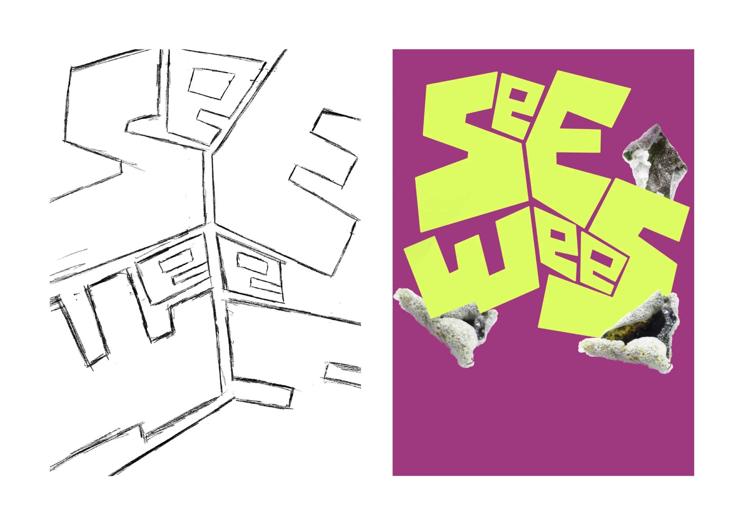
This was a university assignment aimed at creating a packaging design for a fictional seaweed snack brand ’SeeWees’. It was a first assignment of the 4th semester to get us started, so it was small and encouraged style exploration and understanding the value of unique and contemporary designs in product packaging.
The Mission:
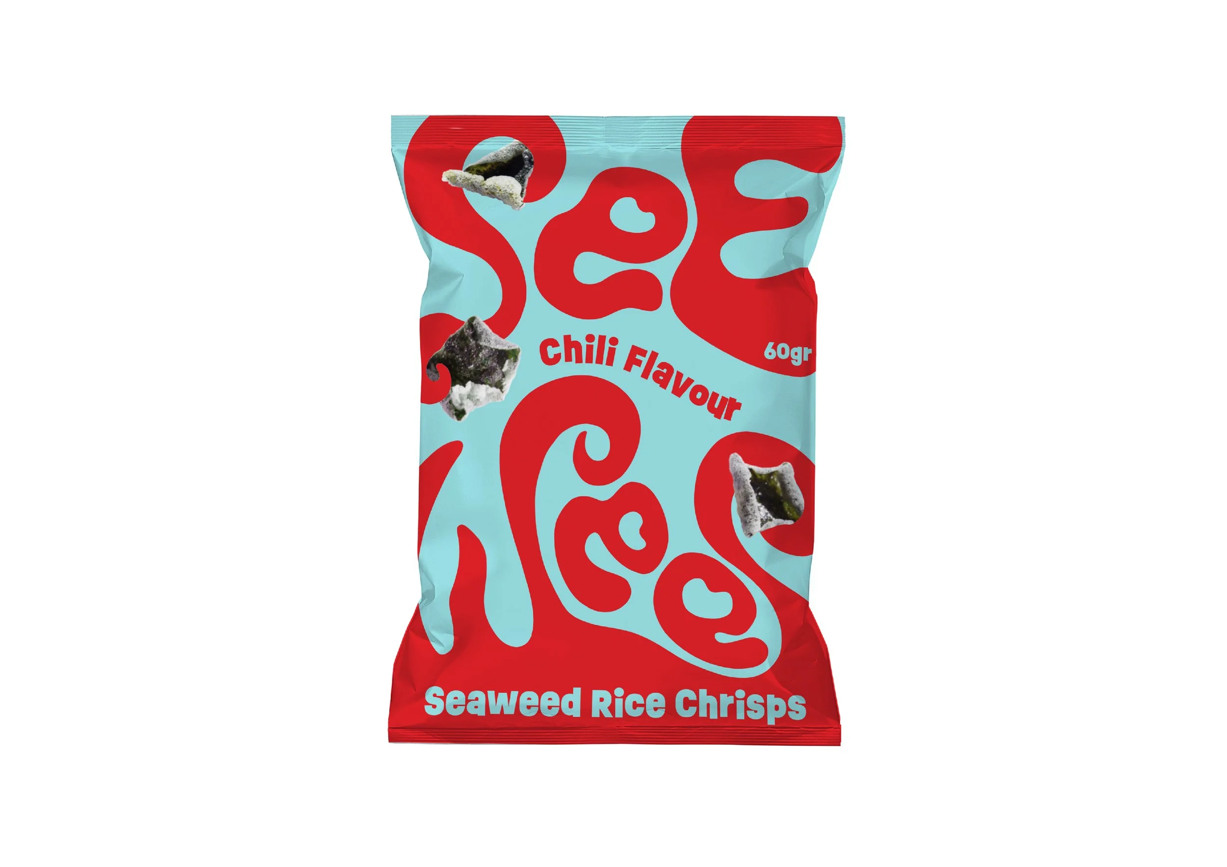
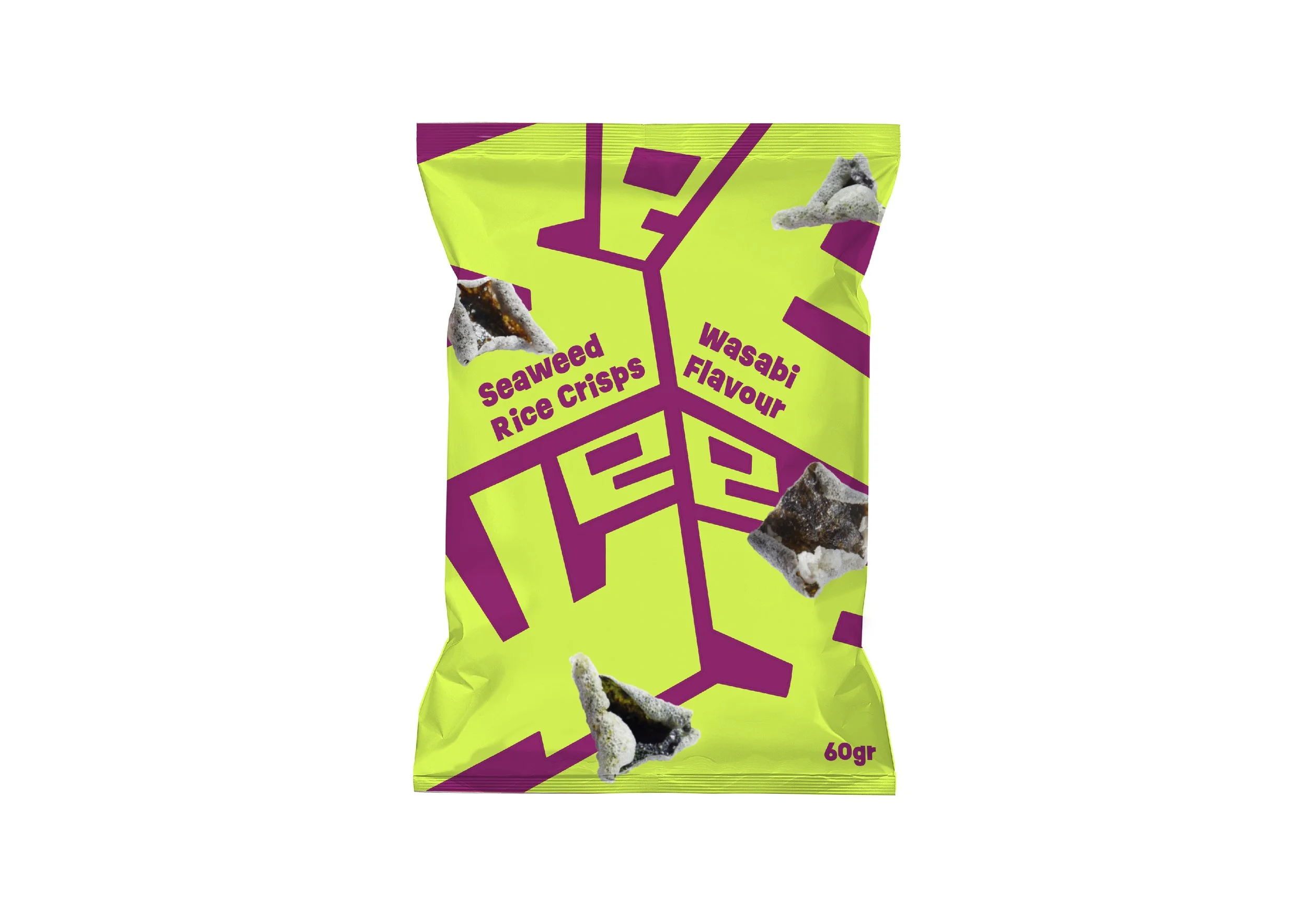
I needed to create a visual style for the brand as well as design a wordmark and pick a compelling colour palette to create a great and tasteful packaging that doesn't fit in, but stands out by originality. I only needed to create the front of the packaging.
The Results:
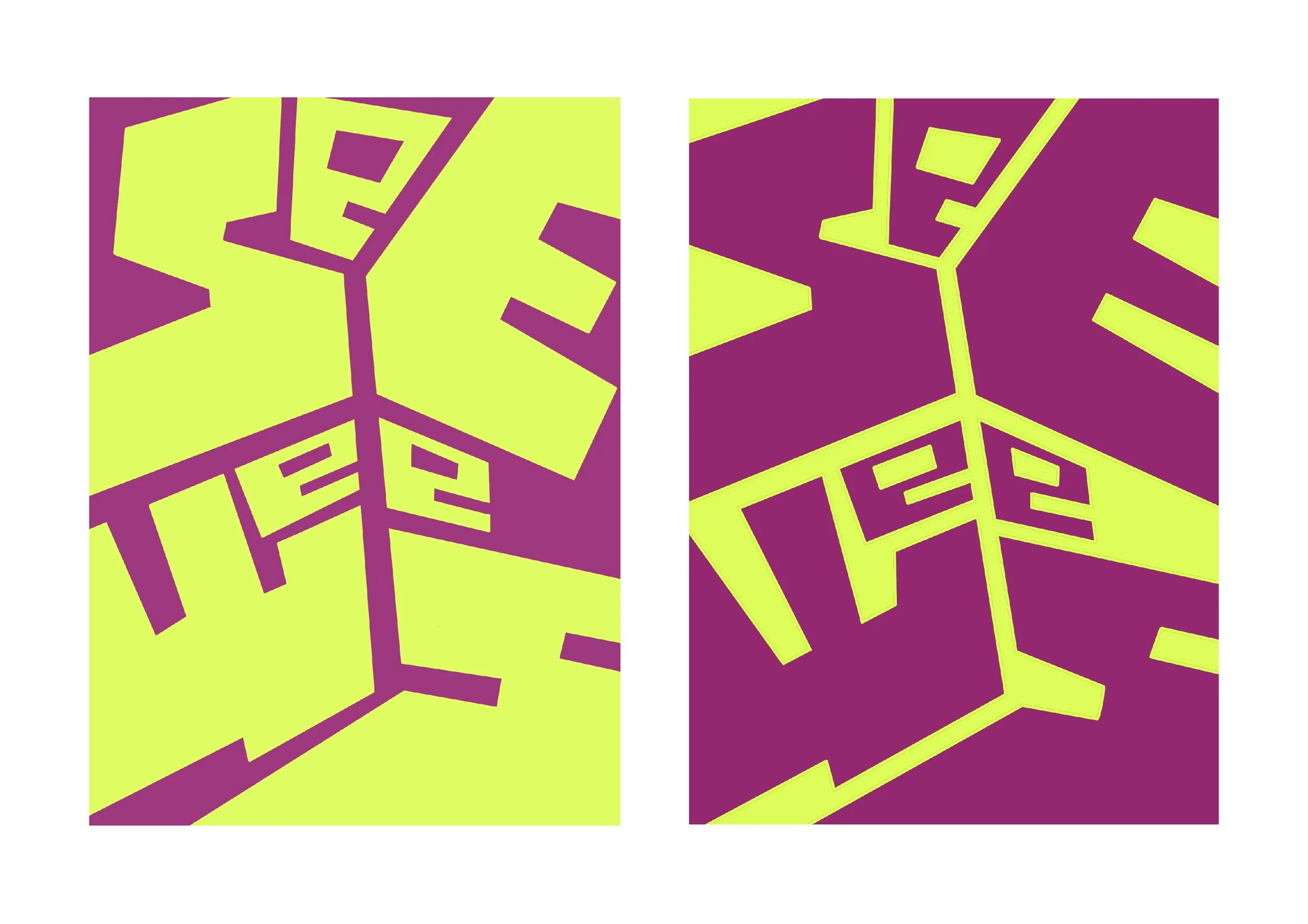
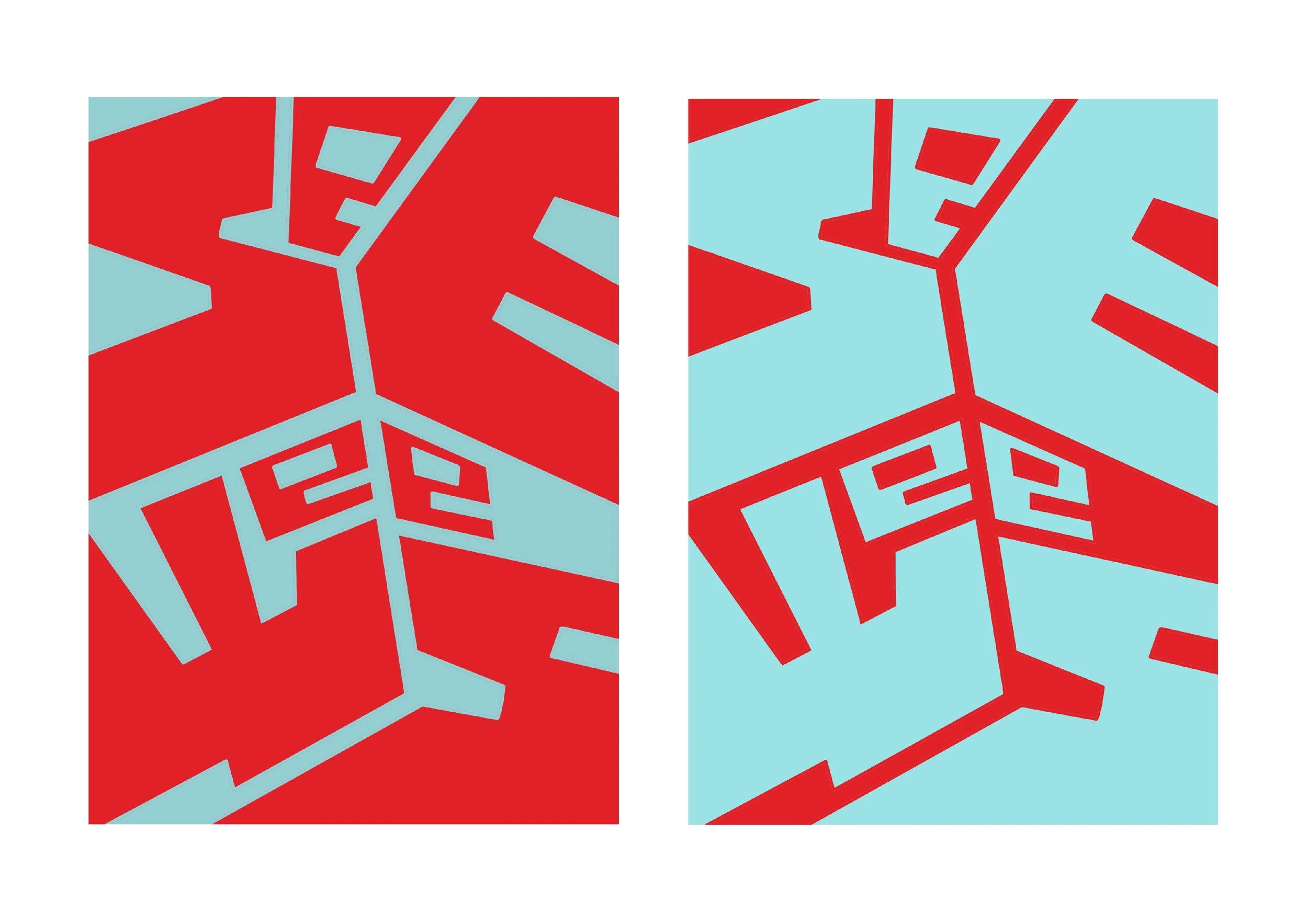
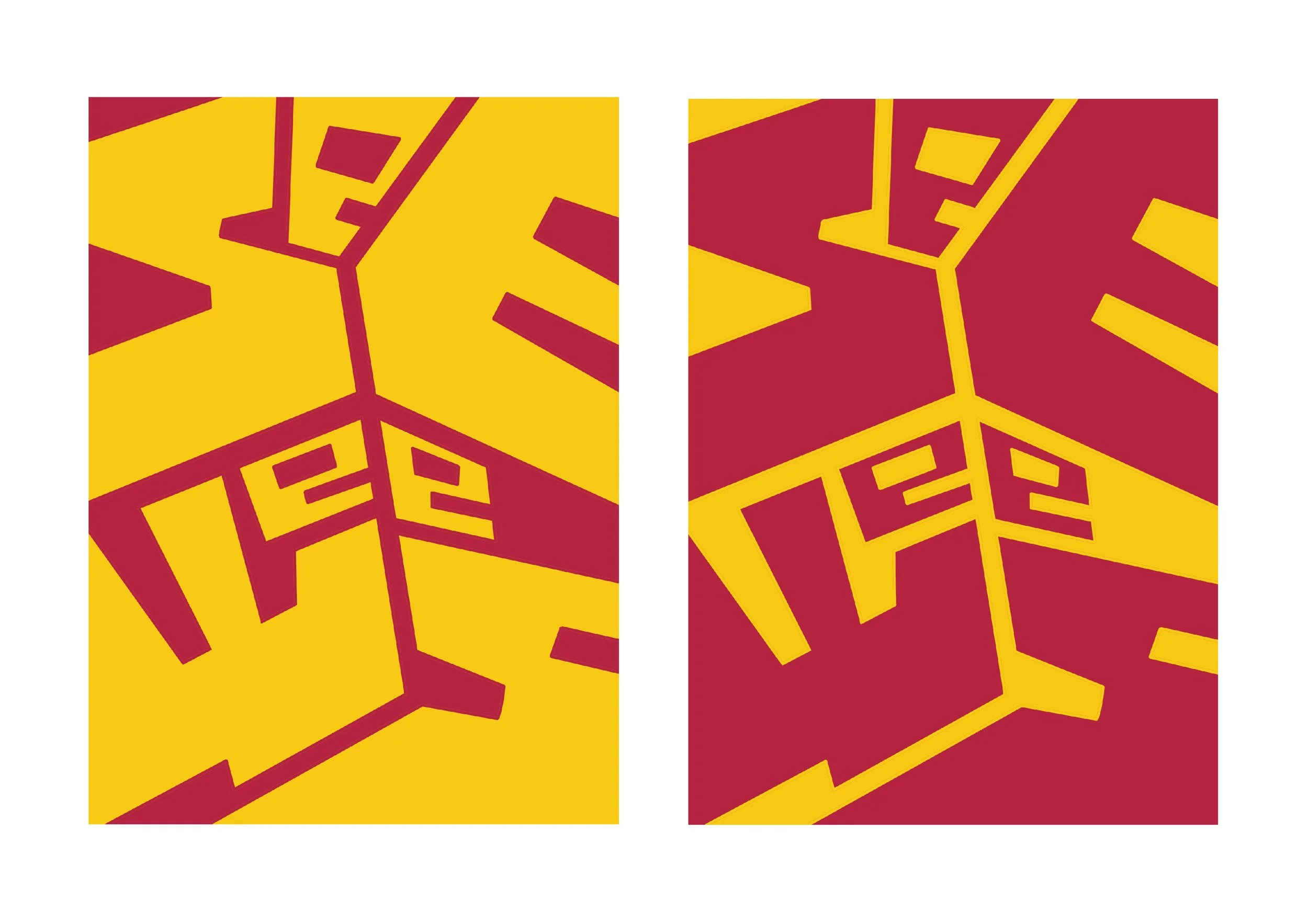
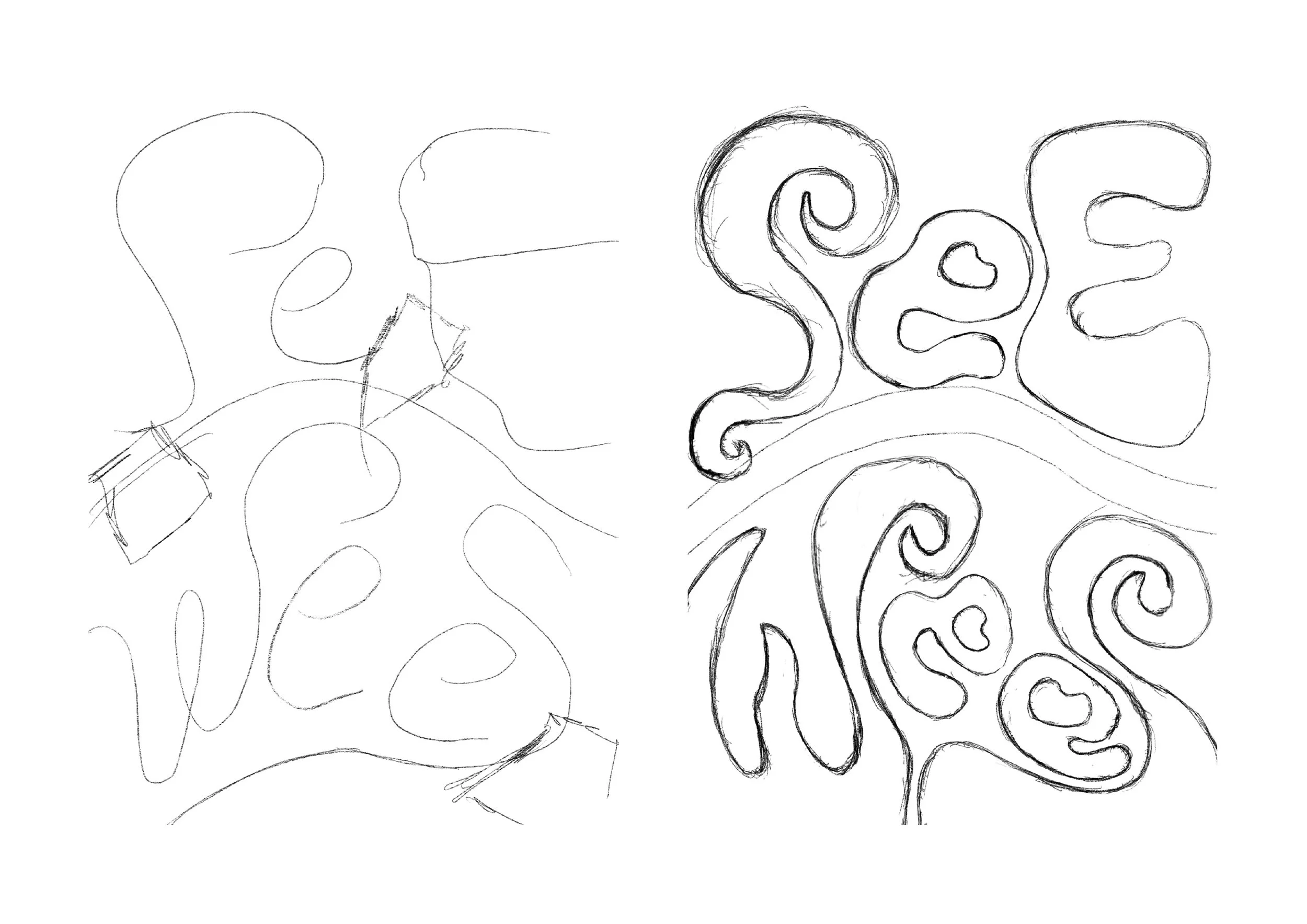
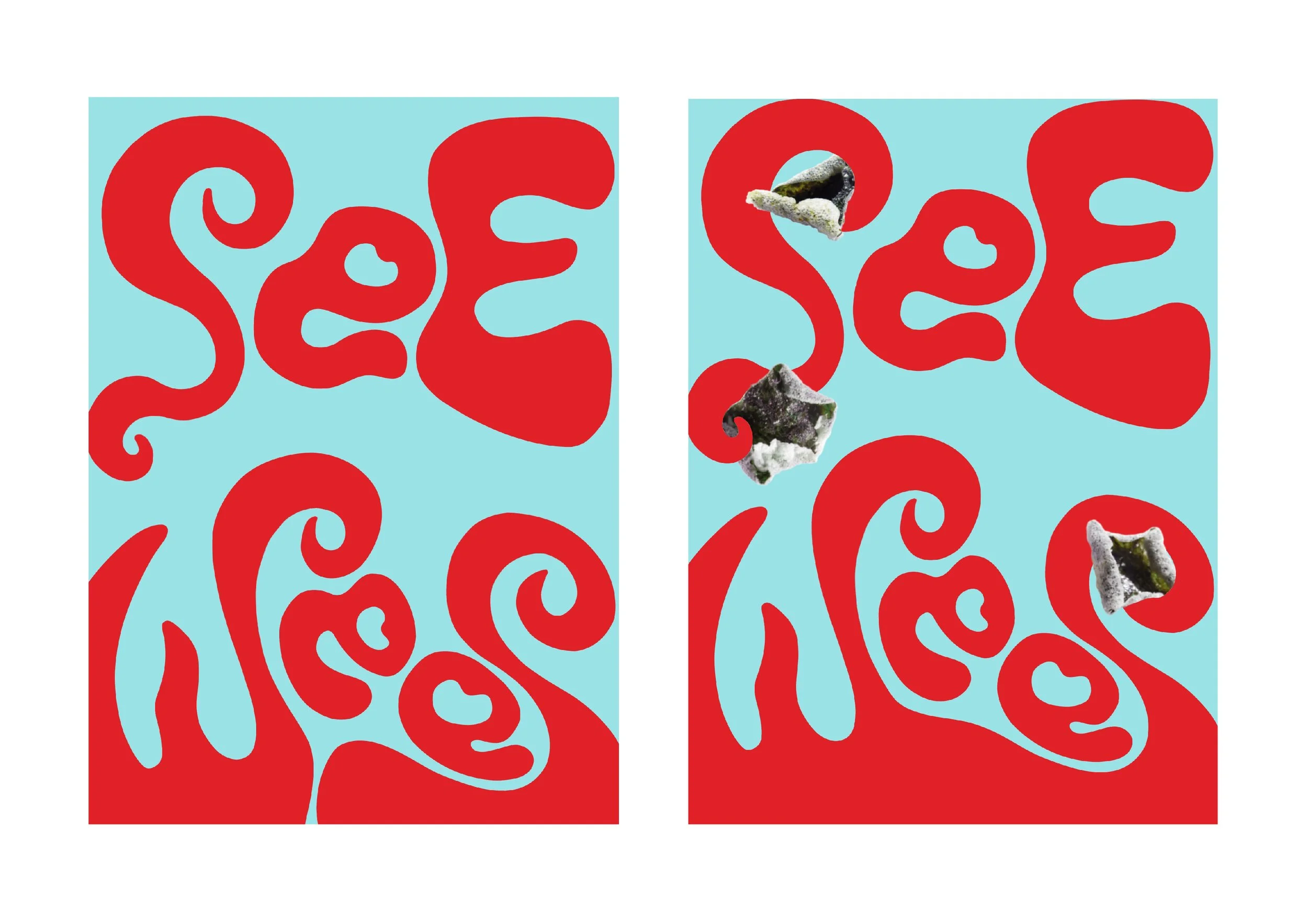
I wanted to go for bold and in your face graphical style, but in order not to overcrowd the design, I would keep it simple with by just only using two colour whilst letting the wordmark design do the talking. The main part of the branding is bold and chunky hand lettered type as my word mark. Instead of just choosing a typeface and writing ’SeeWees’ on it, I wanted to make it almost an illustration with hand lettered type. The colours are bright, clearly reflecting the flavour of the snack whilst grabbing the attention of a buyer. In the end I ended up with two different designs